Sales & Operations
Intelligence Platform
End-to-end Power BI migration, real-time operational dashboards, and Python-automated workflows for North American automotive operations serving Honda and General Motors.
The Challenge
Reporting was fragmented across legacy Excel sheets, manual extracts, and disconnected systems. Leadership lacked real-time sales visibility, and analysts spent 60% of their time on data preparation rather than analysis. Monthly reports took 3–5 days to produce.
Our Solution
We migrated the entire reporting infrastructure to Power BI with scalable server architecture, built Python + Selenium automation for data extraction workflows, and created a suite of real-time dashboards covering sales, inventory, operations, and regional performance.
The Impact
Manual reporting effort reduced by 30%. Sales leadership gained instant access to real-time operational data. Monthly reports now auto-generate in minutes, not days. Forecast accuracy improved through SKU-level granular analysis and automated variance tracking.
Dashboard View 01
Sales Performance
Command Center
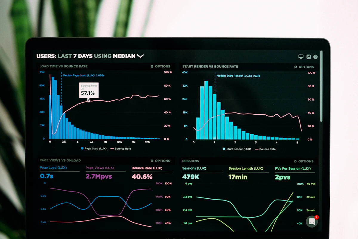
Executive-level sales overview with regional breakdown, YTD performance, and inventory health — refreshed every 15 minutes from live data feeds.
Key Results
Measurable Impact
from Day One
Dashboard View 02
Operations & Supply
Chain Monitoring
Dashboard View 03
Regional Performance
Breakdown
| Model | Units Sold | Revenue | vs Target | Trend | Status |
|---|---|---|---|---|---|
| CR-V | 9,824 | $412M | +14% | ↑↑ | On Track |
| Civic | 8,291 | $189M | +8% | ↑ | On Track |
| Silverado | 7,445 | $356M | -3% | → | Watch |
| Pilot | 5,902 | $298M | +2% | ↑ | On Track |
| Equinox | 4,821 | $148M | -8% | ↓ | At Risk |
Technical Stack
Technologies
Deployed
Architecture
How It Was
Actually Built
The migration began where these projects usually have to begin: with the reports themselves. Legacy Excel and Access reporting had accumulated years of embedded business logic — lookup tables, manual adjustments and rules that existed nowhere except in a formula. Before any of it could move to Power BI, that logic had to be extracted, documented and agreed, because migrating an undocumented calculation simply relocates the problem.
The data layer was rebuilt on SQL Server 2019 with Azure Data Factory orchestrating scheduled extraction from source systems. Where a system exposed no usable interface, Python with Selenium WebDriver and PyWin32 automated the retrieval that staff had been doing by hand — an unglamorous but decisive part of the work, since a dashboard refreshing automatically against a manually-produced file is not automated at all.
On top of that sits the Power BI semantic model: a star schema with DAX measures defined once and reused across every report, rather than each report carrying its own version of 'units sold'. That single decision is what makes regional and executive views reconcile without argument, and it is the most common thing missing from dashboards we are asked to repair.
Delivery
How an Engagement
Like This Runs
Retrospective
What We Would
Do Differently
Every engagement teaches something. These are the decisions we would change if we started this one again.
The semantic model should have come before the first dashboard, not alongside it. Building visuals while measure definitions were still being agreed meant some early reports had to be rebuilt once the canonical definitions landed.
We would also front-load the browser-automation work. It was treated as a secondary integration task, but it turned out to sit on the critical path — no amount of modelling progress mattered while a source still depended on someone downloading a file each morning.